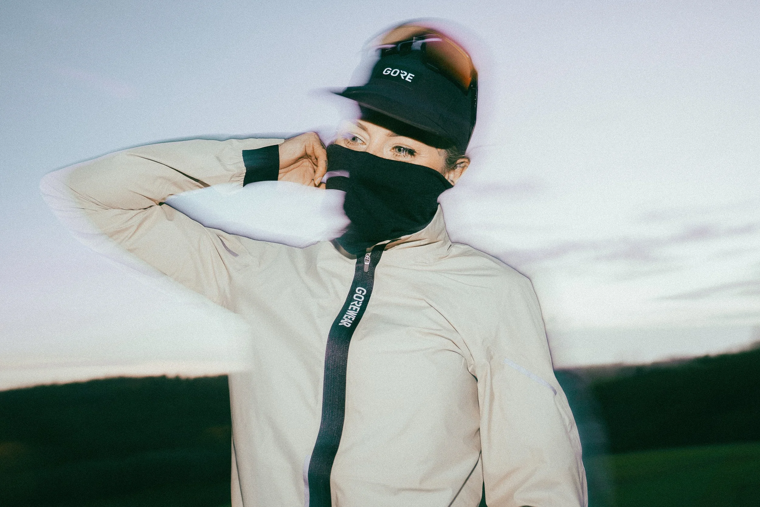
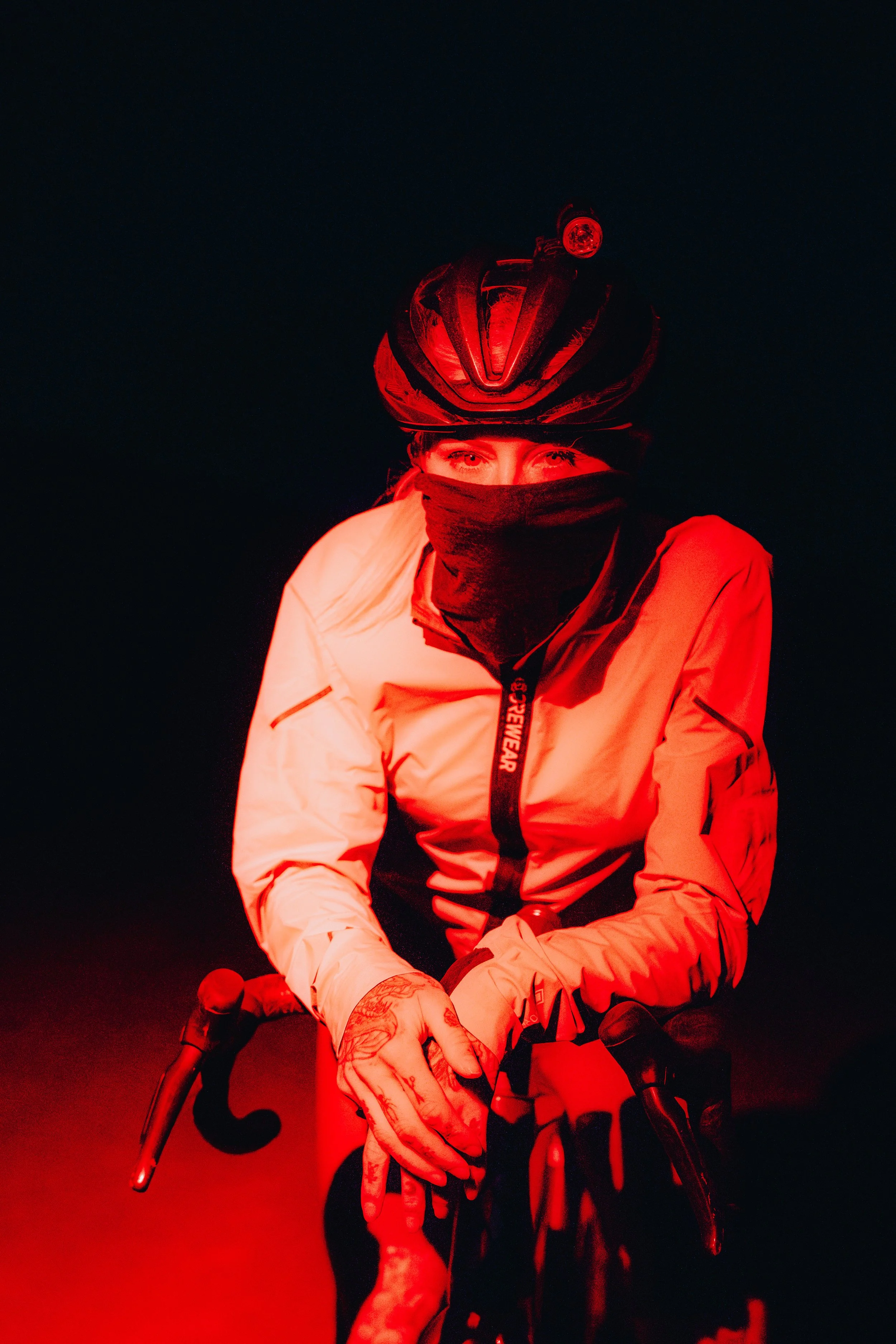
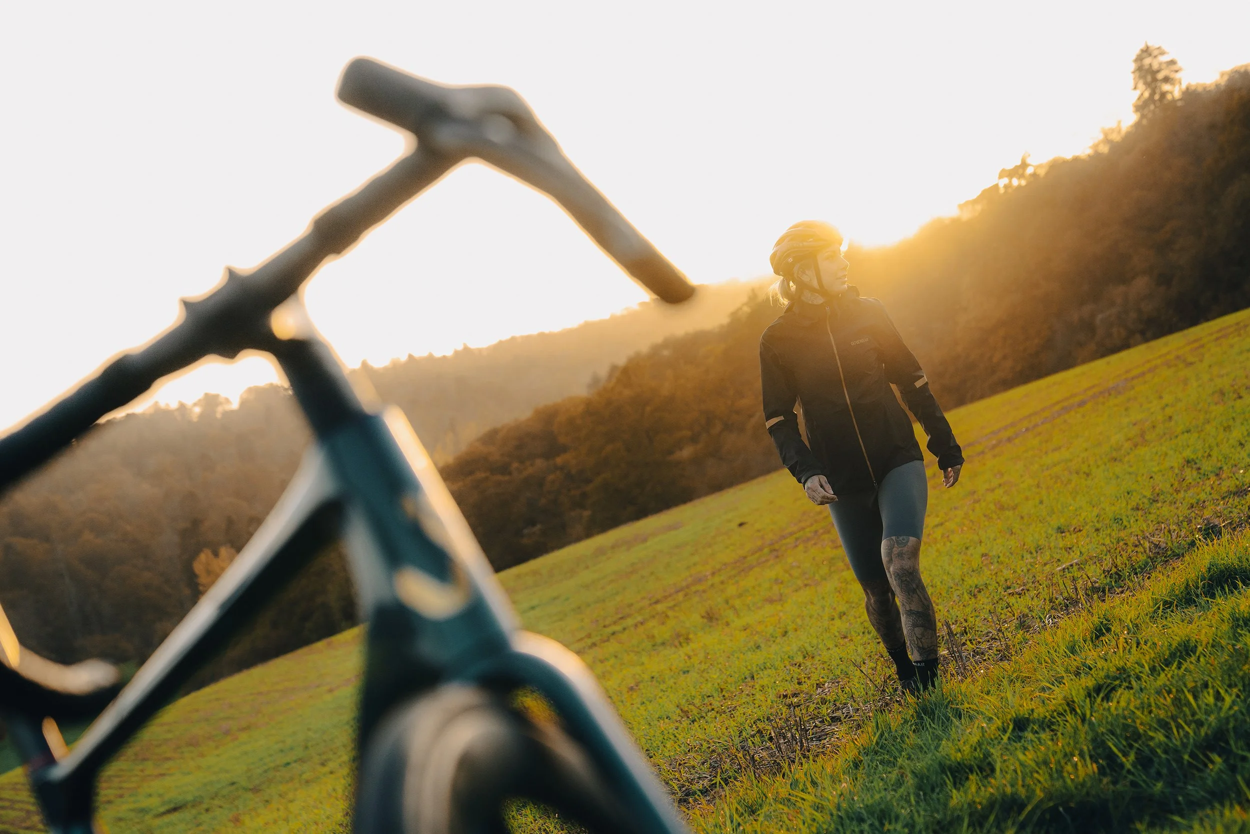
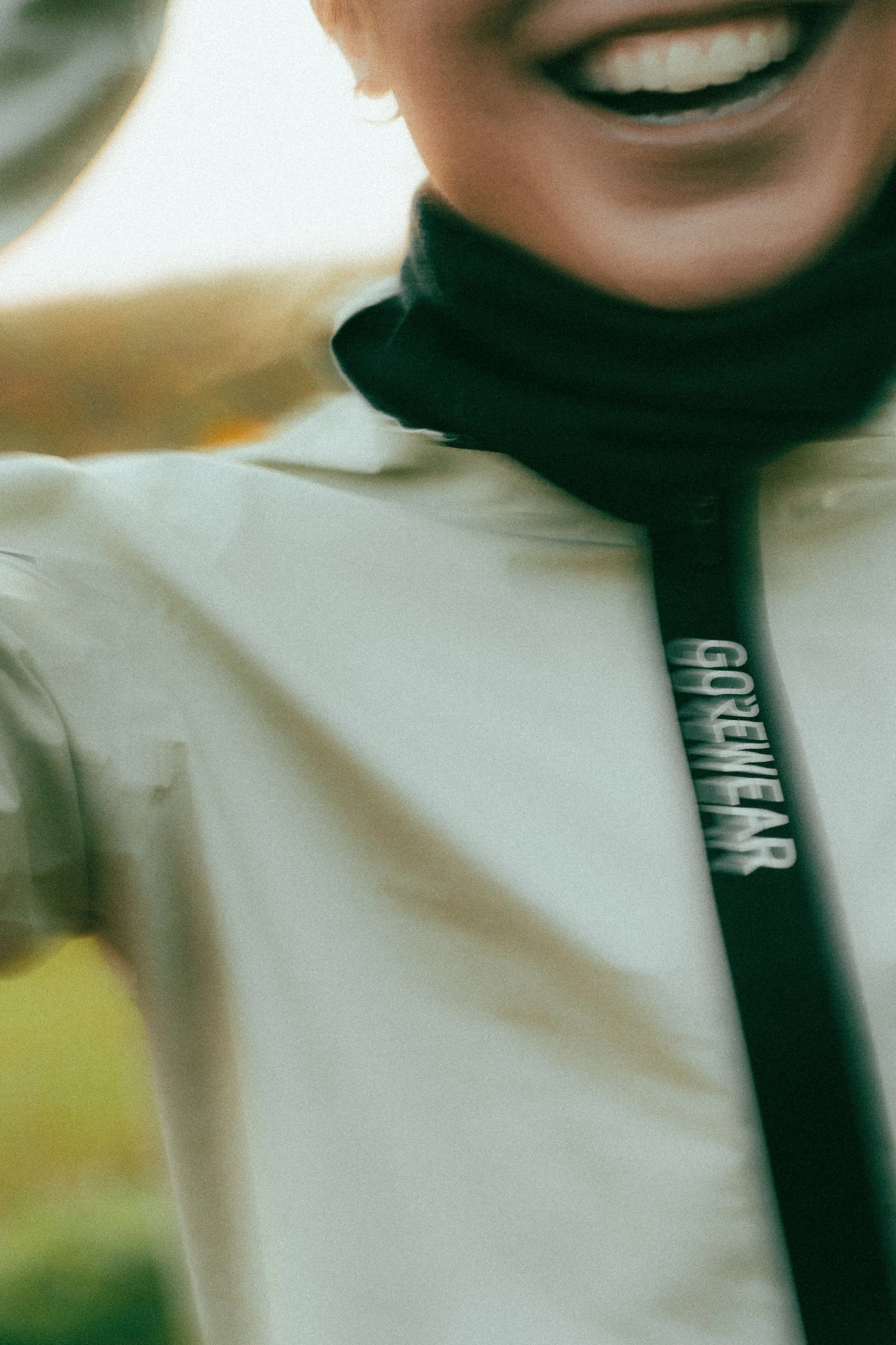
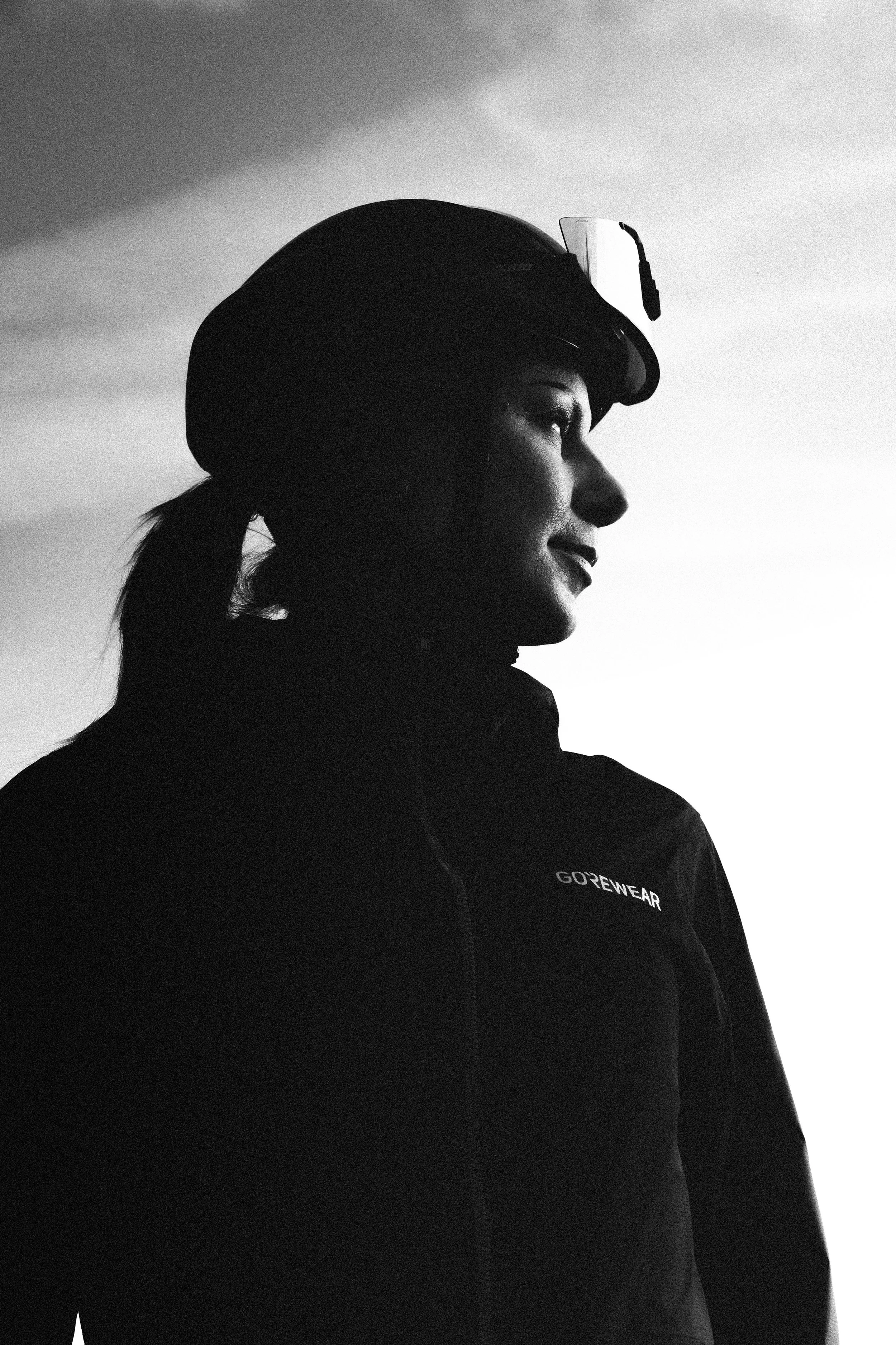
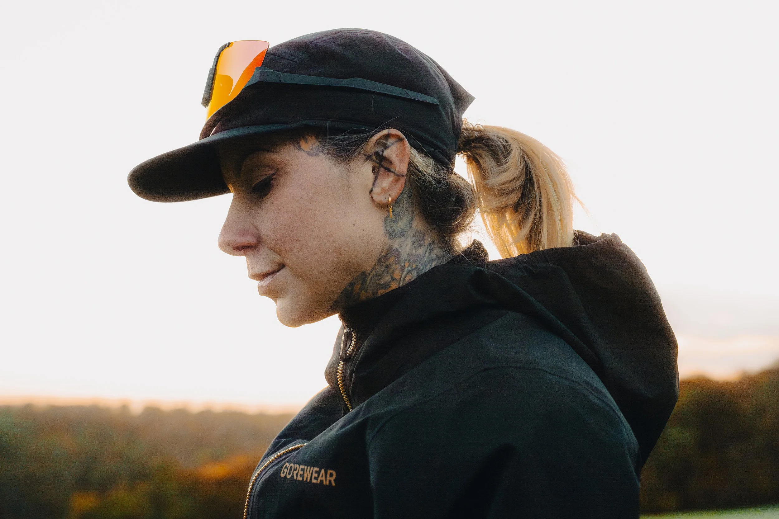

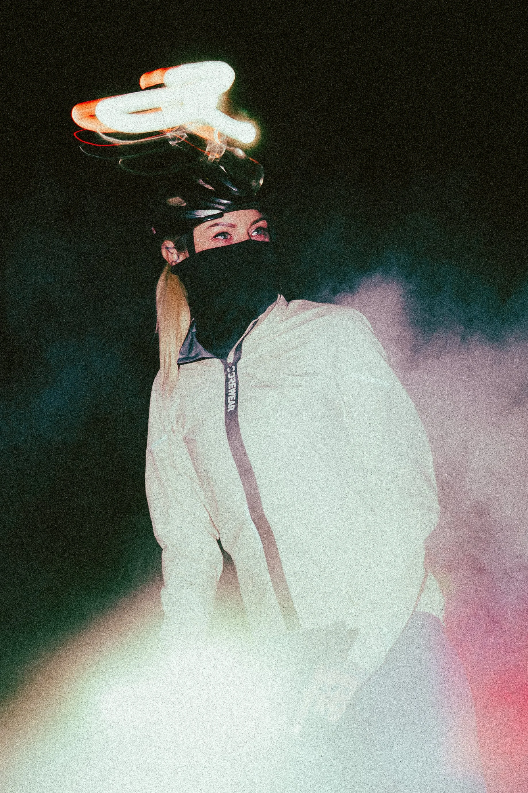
Creatively, I approached this project like a visual story rather than a catalogue. Locations, timing, and framing were chosen to complement the design language of the apparel, letting colour, form, and motion work together. The result is imagery that feels considered and distinctive, helping the brand stand out in a crowded market without shouting.
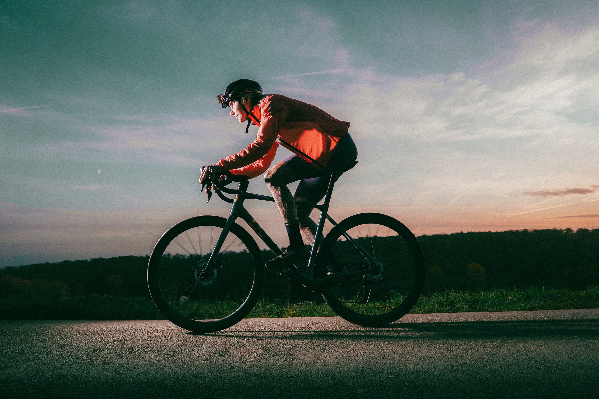
From a commercial point of view, the final image set was created to work hard across multiple platforms. The photographs translate easily between campaign use, web, and social, while maintaining a consistent visual identity. It’s work that adds value not just by looking good, but by giving the brand a clear, recognisable voice.
↓